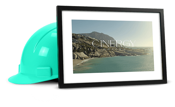
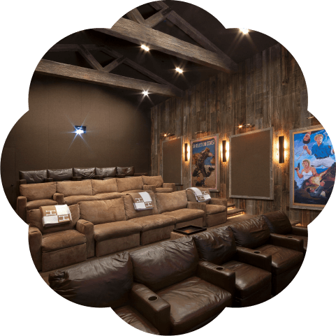
Cinergy needed more than a new look. They needed a brand that felt like the spaces they build.
So we gave them just that.
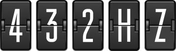
The Root of All - Frequency
Cinergy doesn’t build spaces. They build resonance.
At the core of the brand is 432 Hz a frequency known for calming and centering.
It became the foundation for everything we designed.
Click play to listen to the music.
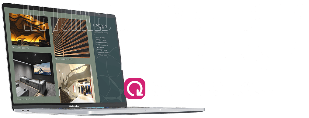
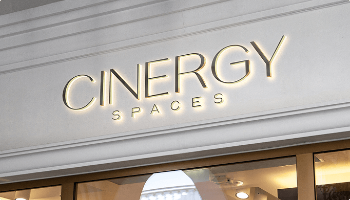
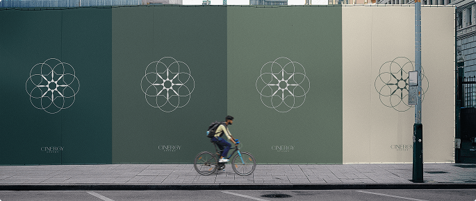
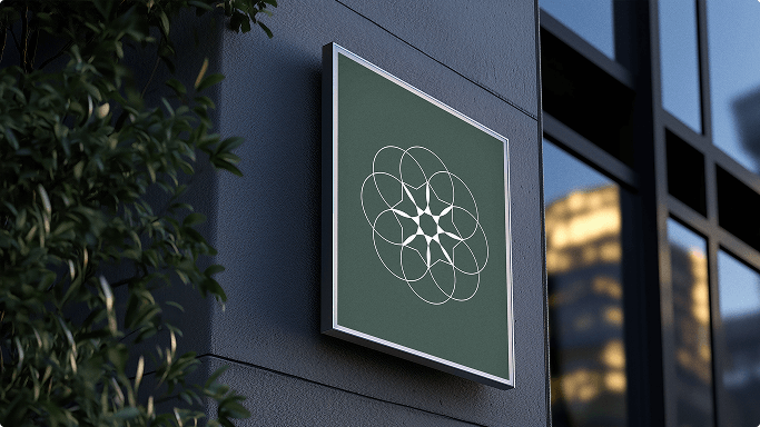
Visual Identity - The Mark
That emblem? It’s more than a logo. It’s a visual translation of 432 Hz.
Its circular form reflects Cinergy’s full-circle philosophy: symmetry, harmony, and sensory flow. A mark designed to feel as intentional as the acoustics in their rooms.
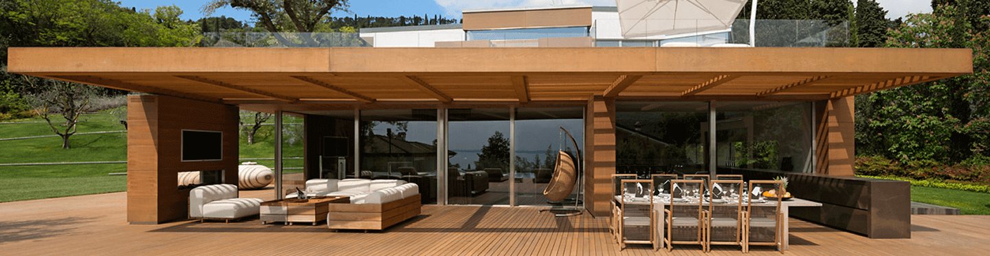
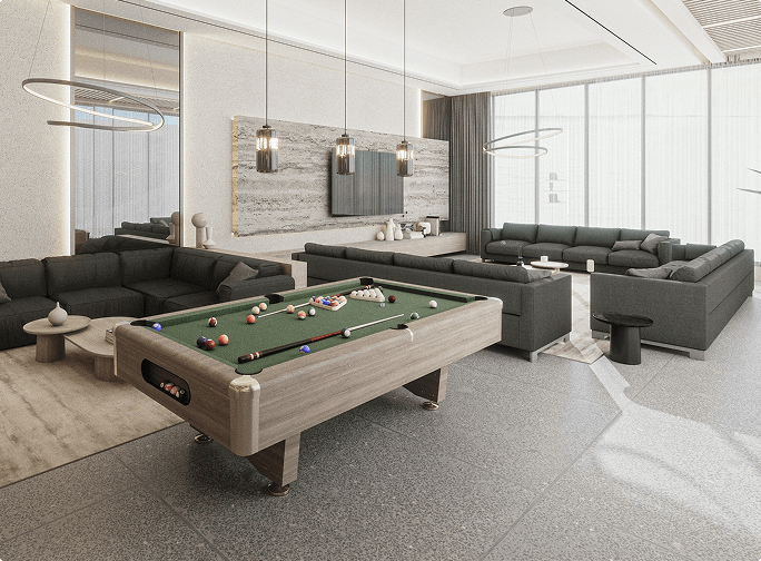
Visual Identity - The Palette
We built a palette that sounds like silence.
Greens, clays and slates drawn from natural materials.
Anchored by the hero color, Midnight Slate — HEX #1D3335.
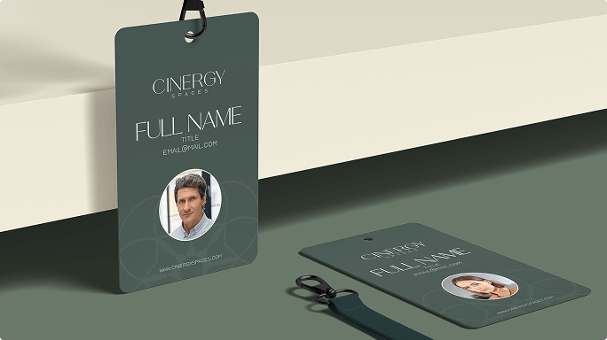
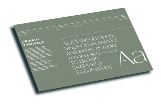
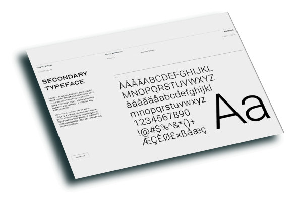
Visual Identity - The Mark
Strong, structured, minimal.
The Cinergy type system carries weight without noise.